Wednesday, 28 September 2011
Wednesday, 21 September 2011
Futurism in History
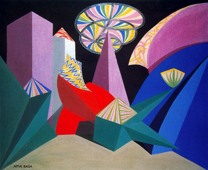
Futurism was a direction rather than a style. Its encouragement of eccentric behaviour often prompted impetuous and sometimes violent attempts to stage imaginative situations in the hope of provoking reaction.
Through a barrage of manifestos that dealt not only with various aspects of art, such as painting, sculpture, music, architecture, and design, but with society in general, the Futurists proclaimed the cult of modernity and the advent of a new form of artistic expression, and put an end to the art of the past. The entire classical tradition, especially that of Italy, was a prime target for attack, while the worlds of technology, mechanization, and speed were embraced as expressions of beauty and subjects worthy of the artist's interest.
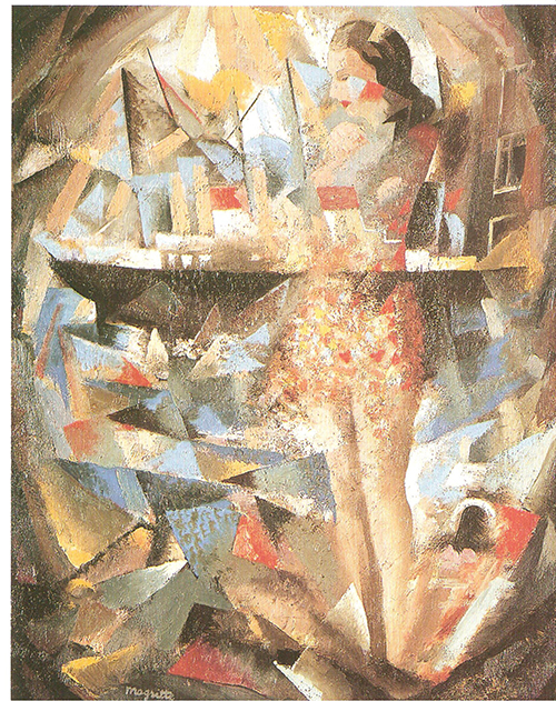
The Cubists' rational form of experimentation, and intellectual approach to the artistic process, also contrasts with the Futurists' vociferous and emotive exhortations for the mutual involvement of art and life, with expressions of total art and provocative demonstrations in public. Cubists held an interest in the objective value of form, while Futurists relied on images and the strength of perception and memory in their particularly dynamic paintings.
 |
| Feu d'artifice - Giacomo Balla |
 | ||||||||||||||
Jeunesse - Rene Magritte - 1924 |
What is "Pre-futurism"?
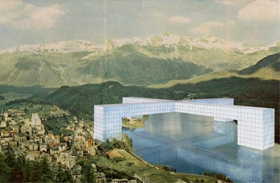
"Pre-futurist": A dysfunctional marriage between the utopian, the surreal and the future, yet grounded in the present and the now because of the limitations at the moment. It looks towards the future from the seat of post-modernism; what could technology bring in terms of new materials, new construction methods? What would architecture be when constrained by space- building up and though? When people are more concerned about sustainability and revival? "Pre-futurism" is a view of how buildings could look in another century from now "the future", without going through the development of the first fifty years.
Architects that come to mind: Zaha Hadid, Frank Gehry...
"Pre-Futurism is not one of those feel-good "carpe diem" movements or anything nearly so trite. How could we possibly hope to seize the day when the day so completely seizes us?
Pre-Futurism is not stuck in the moment, ignorant of consequences and empty of plans, doomed to future failures by repetition of a forgotten history. Pre-Futurism expands the moment, transforms it to Now, and includes in it consequences, plans, and a very long memory.Pre-Futurism ain't about to get all hung-up on what's to come, anyhow, man. Pre-Futurism ain't gonna sit around moping over what coulda been. Pre-Futurism needs nothing more than Now for motivation."
Architects that come to mind: Zaha Hadid, Frank Gehry...
What Could A "Pre-futurist" Building Look Like?
Friday, 16 September 2011
Thursday, 15 September 2011
Building
Wednesday, 14 September 2011
Interior - Showing light effects
Monday, 12 September 2011
Lasercutting
The cut out parts from the "open air spa" level. Make interesting island shapes. Could be used for the urban private part multifunctional area (sitting, steps, lying down), as they can be arranged to make overhangs for privacy/reading, gentle slopes for sitting, or tables for study areas.
 |
| A "Table" and seat made by the two islands. |
 |
| Compelling, interesting shapes. This could be a group area or the steep side used for private study. |
 |
| Play area for kids? |
Sunday, 11 September 2011
Building Take #2
 |
| Playing around with elements of football. Wrapped the field lines in a random way around the object. |
 |
| Working out the dimensions and how to arrange the shapes. |
Friday, 9 September 2011
Thursday, 8 September 2011
Initial Concept
3D Tetris made into a building form. The separate shapes twist into negative/positive spaces left by the other shapes. There aren't defined levels, the "floors" are separated by each block.
Subscribe to:
Comments (Atom)


